
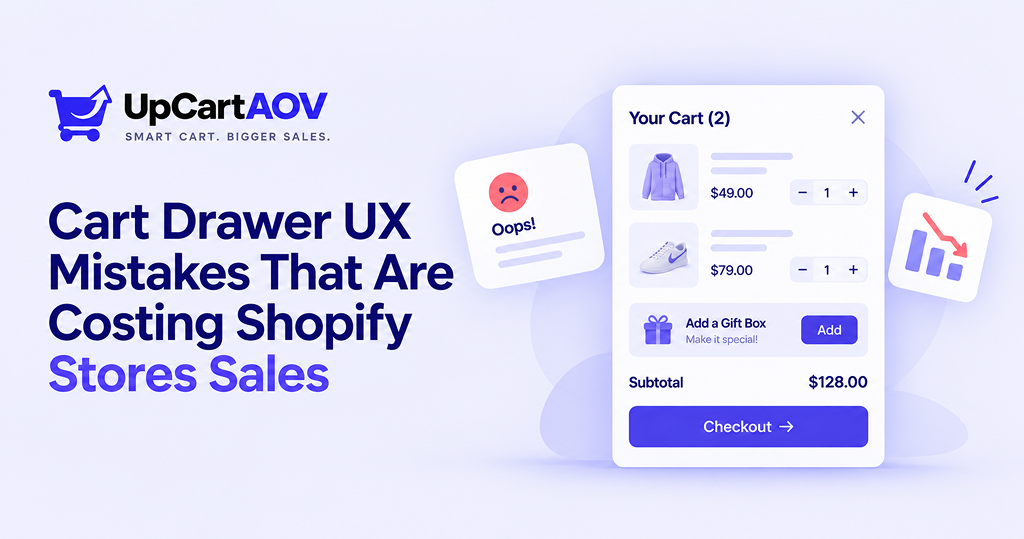
I’ve worked with many Shopify brands over the years, and almost every time someone comes to me about conversion or AOV problems, the issue traces back to a handful of the same repeat mistakes, most of them hiding in one place: the cart drawer.
I’m Anurag Pandey. I build Shopify stores and apps for a living, and I’ve spent the last few years inside merchant dashboards, theme code, and cart drawers just like the one you’re about to read about. If you’re a Shopify founder dealing with something similar, feel free to connect with me; I’m always happy to talk shop.
One recent example was a skincare brand I worked with on Shopify. Their traffic had grown 40% in three months. Revenue hadn’t moved.
Digging through session recordings, we found the problem: customers were opening the cart drawer, pausing for a few seconds, and closing the tab. No errors. No crashes. Just quiet abandonment.
Their team posted about it in a merchant group late one night. That’s how they found me.
When I saw their drawer, nothing was technically broken. It was just badly designed. And that’s the trap: a cart drawer rarely fails loudly. It fails in silence, one abandoned session at a time.
Over a few weeks, we went through their store mistake by mistake. Here’s that story, the same Shopify cart drawer UX mistakes I see on almost every store I audit.
The Simple Flow Behind Every Cart Drawer
Before touching any code, I sketched this out for their team. It’s the exact path a customer takes after clicking “Add to Cart”:
| Add to Cart clicked │ ▼ Drawer opens instantly? ──No──▶ Customer re-clicks or leaves │Yes ▼ Item confirmed visually? ──No──▶ Customer unsure, may abandon │Yes ▼ Sees shipping bar / upsell / clear CTA? ──No──▶ Drawer feels empty, cart abandoned │Yes ▼ CHECKOUT |
Every “No” branch was a leak. Each mistake below fixes one of them.
Here’s what a healthy drawer looks like versus a leaky one:
| Cart Drawer (Done Well) | Cart Drawer (Done Poorly) |
| Opens instantly, no lag | Slow, janky animation |
| One clear checkout button | Multiple competing buttons |
| Shows shipping incentive | Shipping info hidden |
| Suggests relevant add-ons | No upsell, no cross-sell |
| Confirms item added | No feedback at all |
Mistake #1: The Drawer Feels Slow and Janky
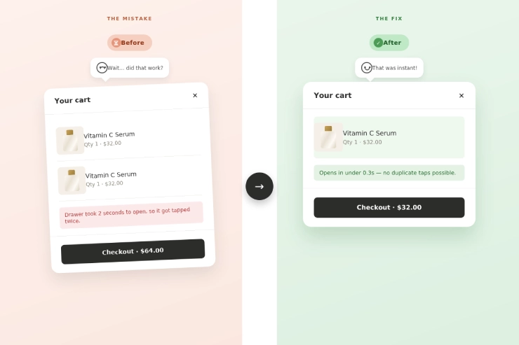
A support email tipped us off: “I clicked add to cart twice — nothing happened.” Their drawer used a heavy, outdated animation script. On mobile it took nearly two seconds to open, long enough for shoppers to click again and accidentally duplicate items.
My advice: test your own cart drawer on a mid-range phone with a throttled connection, not your work laptop on office Wi-Fi. I’ve caught this exact “double-add” bug on client projects just by using a three-year-old phone for five minutes.
This is one of the most overlooked Shopify cart drawer UX mistakes because it’s invisible in a screenshot.
The fix: swap heavy scripts for lightweight, async-loading cart blocks. Speed alone can meaningfully reduce cart abandonment Shopify drawer issues.
Mistake #2: The Shipping Incentive Nobody Sees Twice
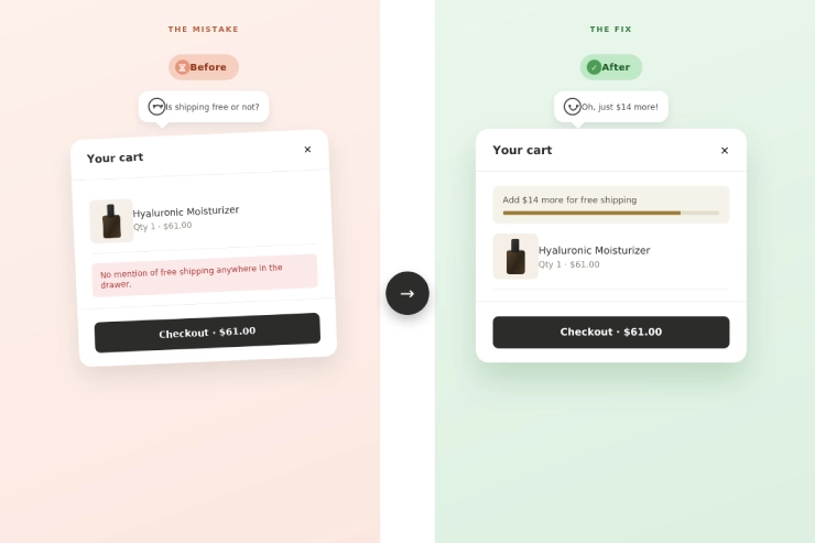
Their average order value had been flat for months. Their “Free shipping over $75” offer only appeared in a homepage banner, gone the moment a customer opened their cart.
Shoppers weren’t ignoring it. They never saw it again, right when it mattered most, sitting at $61 in their cart, unaware they were $14 away.
My advice: show a real number, not vague encouragement. A specific dollar amount consistently outperforms generic messaging. We added a live free shipping progress bar cart drawer element that updates in real time.
Quick math that made this click for their team:
| Gap to Threshold = Shipping Minimum − Current Cart Value $75 − $61 = $14 left to unlock free shipping |
A visible gap this small is often all it takes to nudge one more item into the cart. It’s a simple example of cart drawer optimization for Shopify stores, small screen space, big behavioral impact.
Mistake #3: A Drawer With Nothing Else to Offer
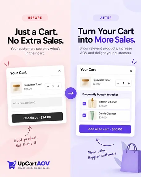
Their product pages had recommendations. Their cart drawer, the highest-intent moment in the journey, had nothing but a checkout button.
My advice: keep it to two or three suggestions, not ten. I’ve seen Shopify merchants overload the drawer with a full carousel, and it backfires, it starts feeling like a second homepage. A tight “Frequently Bought Together” block with one checkbox almost always wins.
This is where one-click upsell in cart drawer placements outperform product-page-only recommendations, pure timing. The customer already decided to buy; you’re just offering one more thing to add.
Mistake #4: Buttons That Compete With Each Other
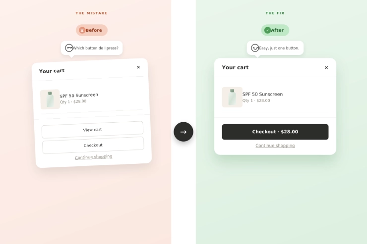
Three buttons sat close together: “View Cart,” “Checkout,” and a “Continue Shopping” link that looked almost identical to Checkout. Session recordings showed shoppers hovering, hesitating, then leaving.
My advice: if you can’t decide which button should be primary, that’s a sign there are too many. Stripping drawers down to one bold CTA consistently reduces hesitation in recordings.
| CTA Element | Before | After |
| Primary button | Same size as others | Bold, high-contrast |
| Secondary actions | Competing for attention | Muted, clearly secondary |
| Button copy | Ambiguous | Single clear “Checkout” |
| Mobile placement | Buried mid-drawer | Fixed near bottom |
A clear hierarchy is one of the fastest wins in cart drawer optimization for Shopify stores, and directly supports better cart-to-checkout conversion rate tips you can apply today.
Mistake #5: Silence When Something Actually Happens
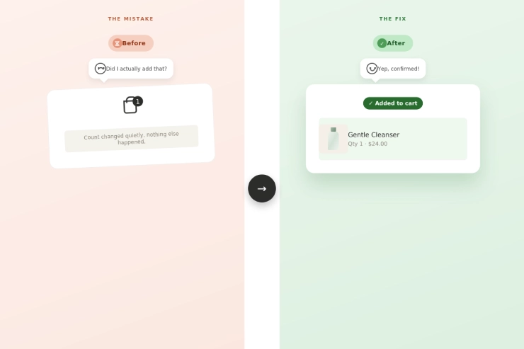
Support tickets kept asking: “Did my item get added?” The cart count updated quietly in the corner; nothing else changed.
My advice: don’t overthink it. A simple auto-open plus a one-second highlight on the new item solves most confusion. The goal is reassurance, not a show.
This small fix reduces re-clicks and duplicate orders, another piece of the puzzle for reducing cart abandonment Shopify drawer friction.
Mistake #6: Built for Desktop, Used on Mobile
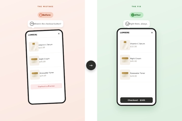
Over 70% of their traffic was mobile, but their drawer was clearly designed for desktop first. The checkout button sat below the fold, requiring a scroll to even find it.
My advice: design mobile first, not desktop. We rebuilt it with a sticky checkout button mobile cart design, fixed at the bottom no matter how many items are added.
Mobile cart drawer best practices aren’t optional anymore; mobile is the majority use case for most Shopify stores.
Mistake #7: A Reward the Customer Never Sees
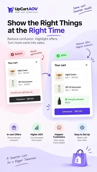
This brand once ran a “free gift over $75” promo, but it only lived on a landing page banner. The cart drawer itself never acknowledged it.
My advice: automate it fully. I’ve seen promotions fail simply because a team member forgot to update the cart manually during a launch. Rule-based logic runs correctly whether anyone’s watching or not.
A Quick Way to Measure the Damage
Before fixing anything, I like to put a number on the problem:
| Cart Abandonment Rate = (Carts Created − Completed Checkouts) ÷ Carts Created × 100 500 carts, 340 completed → 32% abandonment rate |
If that number is climbing while traffic stays flat, your cart drawer is one of the first places worth checking.
I usually ask merchants to run this calculation before and after fixing their drawer, not just once.
A single snapshot tells you where you stand; tracking it monthly tells you whether your fixes are actually working, or whether the number is quietly creeping back up.
The Checklist They Now Run Every Month
- Does the drawer load instantly, on both desktop and mobile?
- Is there clear visual confirmation when an item is added?
- Is your shipping or discount threshold visible inside the drawer?
- Does it suggest at least one relevant add-on?
- Is there one obvious, high-contrast checkout button?
- On mobile, is checkout reachable without scrolling?
- Does a spend-based reward apply automatically?
If more than two of these fail, your drawer is likely costing you sales, quietly, the same way theirs was.
What Changed for This Client
She sped up load time, added a shipping progress bar, introduced a simple upsell prompt, and cleaned up her checkout button. Within weeks, her average order value moved for the first time in months.
None of these changes touched her product pages, her pricing, or her ad spend. The lift came entirely from the last few seconds of the buying journey, proof that small, focused fixes often beat a full redesign.
I’ve seen the same pattern elsewhere. One apparel merchant said a shipping incentive “paid for itself in the first week.” A home goods brand saw AOV rise days after adding an upsell prompt. None of these were big redesigns, proof that cart drawer optimization for Shopify stores doesn’t require rebuilding your theme.
The Last Conversation Before Checkout
None of what fixed there store was complicated. It took attention, a bit of testing on her own phone, and treating the cart drawer as seriously as her homepage.
The Shopify cart drawer UX mistakes covered here aren’t dramatic failures; they’re small, easy-to-miss gaps that quietly cost sales every day.
For a customer who’s already decided to buy, the cart drawer is the last conversation your store has with them before they check out, or quietly close the tab.
A Few Questions Shopify Merchants Ask Me
Question: Does a cart drawer improve conversion rate?
Answer: Yes. It keeps shoppers in their browsing flow instead of redirecting them, which typically supports better cart-to-checkout conversion rate tips compared to a traditional cart page.
Question: Cart drawer or cart page?
Answer: Most modern Shopify stores should lead with a drawer. A full cart page can exist as a fallback, but the drawer should carry most of the weight.
Question: Will cart drawer apps slow down my Shopify store?
Answer: Not if built correctly. Lightweight, async-loading blocks avoid the exact performance issue we found in there store.
Question: How many products should I show in a cart drawer upsell?
Answer: Two or three is the sweet spot. I’ve tested this across several Shopify stores, beyond three, the drawer starts to feel cluttered and the “quick add-on” moment turns into a browsing decision, which is the opposite of what you want right before checkout.
Question: Do I need a developer to fix these cart drawer UX mistakes?
Answer: Not for most of them. Things like button hierarchy, shipping bar copy, and upsell placement can usually be handled through your theme editor or a no-code app. Custom animation or performance fixes may need light dev help, but nothing here requires a full rebuild.

