
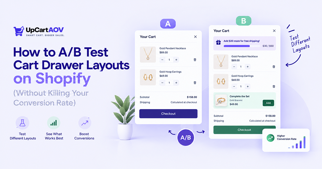
A few months back, a Shopify merchant came to me with healthy traffic, working ad spend, and steady add-to-carts, but revenue kept leaking somewhere between “add to cart” and checkout.
Their cart drawer looked fine at a glance. Look closer, and it was cluttered: five trust badges, a shipping bar that never filled up, and an upsell section buried so low nobody scrolled to see it.
They’d built it once and never touched it again.
That’s the story behind almost every cart drawer I’ve reviewed in 14+ years of building Shopify stores at ControlF5. Merchants polish the homepage for weeks and treat the cart drawer as done.
It’s not; it’s one of the last things a shopper sees before they buy or bounce, and small changes here often move revenue more than a full homepage redesign.
This is my practical walkthrough of how to A/B test cart drawer layouts on Shopify: what to test, how to set it up right, and how to read results without fooling yourself.
These are Shopify cart drawer A/B testing best practices from actually running them, not from a textbook.
Why Most Merchants A/B Test the Wrong Cart Drawer Elements
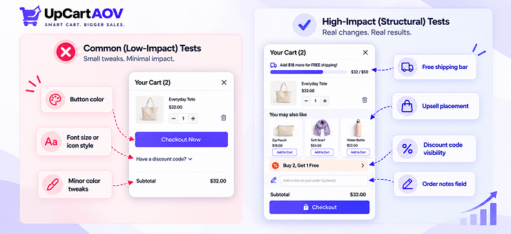
Here’s a pattern I’ve seen across hundreds of Shopify projects: merchants test the small stuff and skip the stuff that actually matters. Things like:
- Button color: does “Checkout Now” beat “Proceed to Checkout”?
- Font size or icon style on the CTA
- Minor color tweaks to match a seasonal sale
These aren’t bad tests. They’re just low-leverage; the button color rarely moves the needle by more than a rounding error.
What actually drives cart drawer performance is structure, not decoration:
- Where the upsell sits, above the line items, below them, or hidden in a collapsed section shoppers never open
- Whether the free shipping bar is visible without scrolling, or buried at the bottom
- Whether the discount code field is front and center, or hidden behind a “have a code?” link that quietly distracts the shopper before they’ve committed to buying
The mistake isn’t testing too little; it’s testing the wrong layer of the page. And because most Shopify store owners have never run a structural test before, they don’t even realize it’s an option.
What Actually Moves the Needle in a Cart Drawer
Before you touch any testing tool, it helps to know which variables are worth your time.
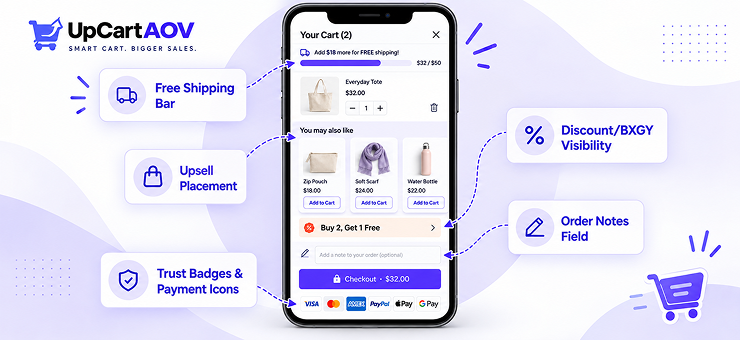
Based on what we’ve built and measured while working on UpCartAOV, our own Shopify cart optimization app, here’s the shortlist that consistently produces meaningful results.
| Cart Drawer Element | What to Test | Why It Matters |
| Upsell placement | Above line items vs. below vs. as a separate expandable section | Upsell placement in cart drawer A/B testing consistently affects how many shoppers even notice recommended products |
| Free shipping progress bar | Position (top vs. bottom), copy (“You’re $12 away!” vs. a plain progress bar) | A free shipping progress bar cart drawer test often shows a direct lift in average order value when the bar is more visible |
| Discount/BXGY visibility | Auto-applied and shown vs. hidden behind a code field | Removes friction at the exact moment a shopper is deciding whether to trust the offer |
| Trust badges & payment icons | Number of badges, placement near the CTA | Too many badges can look like clutter instead of reassurance |
| Order notes field | Present vs. removed | Sometimes a small trust signal, sometimes just noise that slows the shopper down |
Notice that none of these are cosmetic. They’re structural decisions about what information a shopper sees, and in what order. That’s the real difference between a cosmetic test and a cart drawer layout test that actually changes behavior.
Setting Up a Valid A/B Test on Shopify
This is the part most guides skip, and it’s the part that decides whether your results mean anything at all.
Shopify’s native tools are built for page-level testing, things like your homepage or a landing page. There’s no built-in way to split-test a cart drawer layout out of the box.
So you’re left with three realistic paths:
- Theme duplication. Build two versions of your theme with different cart drawer layouts, split traffic between them using a redirect or edge rule. Works, but it’s manual and easy to mess up if you forget to keep everything else identical between versions.
- A dedicated Shopify A/B testing tool. There are many Shopify apps built specifically for split-testing storefront elements, some of which support drawer-level changes rather than just full-page variants.
- Code-level variant rendering. Show variant A to 50% of sessions and variant B to the other 50%, using a cookie or session ID to keep each shopper’s experience consistent across their visit.
Whichever path you pick, the setup rules stay the same:
- Change one variable at a time. If you move the upsell placement and change the shipping bar copy in the same test, you won’t know which change caused the result.
- Keep the test running long enough to cover a full weekly cycle; weekday and weekend shopping behavior can be genuinely different.
- Don’t peek and stop early just because variant B is winning on day two. Early leads flip more often than people expect.
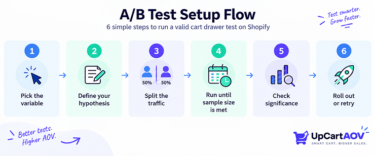
Here’s the flow I walk every client through before we launch a test:
| Pick ONE variable to test │ ▼ Define your hypothesis (“Moving upsells above line items increases AOV”) │ ▼ Split traffic 50/50 (consistent per shopper) │ ▼ Run until sample size + duration thresholds are met │ ▼ Check for statistical significance │ ▼ Winner? ──No──▶ Log it as inconclusive, try a new hypothesis │ Yes ▼ Roll out to 100% of traffic |
This sounds simple on paper, and it mostly is, the discipline is in not skipping steps when you’re excited to see a result.
Cart Drawer A/B Test Ideas, Ranked by Impact
If you’re starting from zero, don’t try to test everything at once. Here’s roughly how I’d prioritize, based on what tends to move cart-to-checkout conversion rate optimization the most in stores we’ve worked on:
High impact, test first:
- Cart drawer vs. cart page, does keeping shoppers on the same screen (drawer) outperform sending them to a dedicated cart page? This is genuinely one of the biggest structural decisions a store can make.
- Upsell placement and format (single product vs. a short carousel of recommendations)
Medium impact, test second:
- Free shipping bar copy and position
- Discount visibility (auto-applied vs. code field)
Lower impact, test later:
- Trust badge count and placement
- Order notes field presence
A quick note on that first one, because it comes up constantly: a cart drawer vs cart page A/B test Shopify merchants run usually shows the drawer winning on conversion, simply because it removes a full page load and lets shoppers keep browsing.
But “usually” isn’t “always”, some product categories, especially higher-consideration purchases, do better with a dedicated cart page where the shopper can slow down.
Test it for your Shopify store instead of assuming.
Reading Results Without Fooling Yourself
This is the section most cart drawer guides skip entirely, and it’s the one that separates a useful test from a wasted one.
The biggest trap is stopping a test too early because one variant “looks like it’s winning.” Small sample sizes swing wildly. You need enough visitors and enough conversions before a result means anything.
A simplified way to think about statistical significance sample size cart tests require: you’re checking whether the difference between variant A and variant B is bigger than what random chance could produce on its own.
A common shorthand formula for estimating minimum sample size per variant is:
n = (Z² × p × (1 − p)) / E²
Where:
- Z = confidence level constant (1.96 for 95% confidence)
- p = your baseline conversion rate (as a decimal)
- E = the margin of error you’re willing to accept
You don’t need to calculate this by hand every time; most A/B testing tools do it for you, but understanding the formula helps you resist the urge to call a winner after 200 visitors when you actually needed 2,000.
Here’s a rough reference table for how sample size scales with baseline conversion rate, assuming a 95% confidence level and a 5% margin of error:
| Baseline Conversion Rate | Approx. Sample Size Needed (per variant) |
| 2% | ~3,000 |
| 5% | ~7,300 |
| 10% | ~13,800 |
Smaller stores often don’t hit these numbers quickly, which is fine; it just means your tests need to run longer, not that you should ignore the math and call a winner anyway.
Other ways people fool themselves:
- Running a cart drawer test at the same time as an unrelated theme update, making it impossible to isolate the cause of any change
- Judging success purely on conversion rate while ignoring average order value, a test can lift AOV while conversion stays flat, and that’s still a win
- Comparing results across different traffic sources (a paid traffic spike during your test will skew everything)
Tools That Make This Easier (Including Where UpCartAOV Fits)
You basically have two ways to run these tests: build it yourself, or use an app that already does it.
| Approach | What It Looks Like | Best For |
| DIY (theme code) | A developer duplicates the cart drawer and manually codes each variant | Stores with in-house dev resources and time to spare |
| Cart optimization app | Toggle layout elements — upsell position, shipping bar, discounts — from a settings panel | Merchants who want to test fast without touching theme files |
The DIY route works, but every new test idea means another round of coding, QA, and theme edits. That adds up fast if you’re testing every month.
This is basically why we built UpCartAOV the way we did. It’s a Shopify cart drawer app that already has the pieces this post keeps coming back to: product recommendations, a free shipping progress bar, threshold discounts, BXGY offers, sitting behind toggles instead of buried in theme code.
So when you want to try upsells above the line items instead of below, it’s a settings change, not a dev ticket.
If you’re comparing Shopify A/B testing tools for cart optimization, the one thing worth checking is whether it lets you change structure (placement, order, visibility) and not just colors and text.
A Simple Test Roadmap for Your First 90 Days
If you’ve never run a structural cart drawer test before, here’s the order I’d suggest, with a real example for each phase so it’s not just theory.
| Phase | Focus | Example Test | What to Watch |
| Days 1–30 | Biggest structural question first | Cart drawer vs. cart page — e.g., “Does keeping shoppers on-page instead of redirecting to /cart increase conversion?” | Cart-to-checkout conversion rate |
| Days 31–60 | Free shipping bar | Variant A: “You’re $12 away from free shipping!” at the top. Variant B: a plain progress bar at the bottom | Average order value (AOV) |
| Days 61–90 | Discount visibility & trust signals | Variant A: BXGY offer shown automatically. Variant B: hidden behind a “have a code?” link | Conversion rate + how often the offer gets used |
By day 90, you’ll also have a baseline conversion rate and a rough sample size number from your earlier tests, so planning test duration gets easier each time; you’re not starting from scratch on the math.
Document every result, even the inconclusive ones. A failed hypothesis still tells you something about how your shoppers behave; for instance, if the shipping bar copy test shows no difference, that suggests shoppers were already noticing it and the real lever might be elsewhere.
Final Thoughts
Testing your cart drawer isn’t about chasing a “perfect” layout, there isn’t one, and what wins for one Shopify store might do nothing for another. It’s about replacing guesswork with a habit: pick one variable, run it properly, read the result honestly, and repeat.
Start small. Even one well-run test in the next 30 days puts you ahead of most Shopify stores, who are still assuming their cart drawer is fine because nobody’s complained about it.
That’s really the whole idea behind how to A/B test cart drawer layouts on Shopify: not big dramatic redesigns, just steady, honest experiments that compound over a few months.
FAQs
Question: Can you A/B test a cart drawer without a developer?
Answer: Yes, if you use a Shopify app built for cart optimization that lets you toggle layout elements directly, rather than hand-coding theme variants.
Question: How long should a cart drawer test run?
Answer: Long enough to hit your required sample size and cover at least one full weekly cycle, usually two to four weeks for most small-to-mid-sized stores.
Question: Does Shopify have native A/B testing for the cart drawer?
Answer: Not out of the box. Shopify’s built-in tools are geared toward full-page tests, so drawer-level testing usually requires a theme duplication approach or a dedicated app.
Question: What’s the single most impactful cart drawer test to run first?
Answer: In most of the stores we’ve worked on, testing cart drawer vs. cart page or repositioning the upsell section produces the clearest early signal.

