
Three weeks ago, a Shopify merchant messaged me with a complaint I’ve heard more times than I can count.
Good traffic, decent ad spend, but people kept vanishing right before they paid.
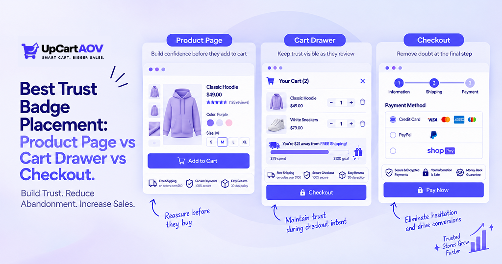
His product page told the story before I even opened checkout: six trust badges stacked above the Add to Cart button, fighting for the same six inches of screen. His cart drawer had none. His checkout page had one lonely padlock icon, so small it might as well not have existed.
He’d done everything “right” by the checklist. He just hadn’t asked where any of it belonged.
That’s the reason this blog exists, and honestly, it’s the short version of my own last fifteen years inside Shopify stores, first building my own, then through the agency work that grew out of that, then eventually building a cart drawer Shopify app because this exact gap kept repeating.
Trust badges aren’t a checklist item. They’re an answer to a question a shopper is silently asking, and that question changes depending on where she’s standing in your store.
Let’s walk through it.
What Counts as a “Trust Badge” in 2026
Before comparing placements, it helps to separate badges into a few buckets, because a badge that works brilliantly on a product page can be dead weight at checkout, and the reverse is just as true.
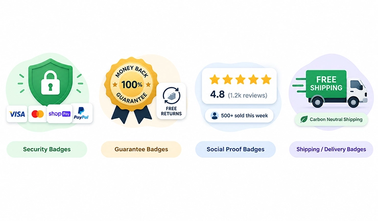
- Security badges: SSL locks, payment provider logos (Visa, Mastercard, Shop Pay, PayPal)
- Guarantee badges: money-back guarantees, free returns, warranty seals
- Social proof badges: review counts, star ratings, “500+ sold this week”
- Shipping/delivery badges: free shipping thresholds, delivery time promises, carbon-neutral shipping
Each of these behaves differently depending on where a shopper runs into it. Someone scanning a product page for the first time is carrying a different doubt than someone who has already clicked “Checkout” and is typing in a card number. That distinction is the whole premise of this blog.
Social Proof, Community & Authority Signals in More Detail
Review & rating signals
- Star rating + review count snippet(“4.8★ from 1,240 reviews”), arguably the single most trusted social proof type in ecommerce, and you don’t have it yet as its own block
- “2,400+ customer photos”, UGC counter, especially strong for fashion/beauty categories
- “47 questions answered”, Q&A activity signals an engaged customer base
Community & repeat-customer signals
- “85% of customers reorder this”, strong for consumables (food, beauty, supplements)
- “230 people have this in their wishlist”, lower-friction than a purchase signal, easier to accumulate for newer products
- “X people recommended this to a friend”, referral-based, if you ever build a referral mechanism
Authority signals
- Press/media mention badges(“As seen in Vogue, TechCrunch…”)
- Expert/professional endorsement(“Dermatologist recommended,” “Vet approved”), fits Beauty and Pet categories specifically
- Certification badges (“Verified organic,” “Cruelty-free certified”), different from Trust stats bar since it implies third-party verification, not just a self-reported number
Experience: What I Saw Testing Badge Placement Across Real Shopify Stores
Here’s where most articles on this topic go generic. I’d rather show you three real moments instead of a general claim.
Case Note 1: A baby & puppy apparel store
Shoppers kept bouncing to the FAQ page mid-browse to check the return policy by hand. We moved the guarantee badge from the footer to right under the Add to Cart button. The FAQ detours dropped off almost immediately.
Case Note 2: A home goods brand, higher-ticket items
Shoppers were opening the cart drawer, looking around, and closing it without checking out. We added one small security badge inside the drawer, next to the checkout button. The “open and abandon” moments thinned out, especially on pricier items.
Case Note 3: A fashion store running frequent promotions
Shoppers were reaching checkout, applying a discount code, then just hovering. We placed a small payment-security badge beside the card field instead of the footer. The hovering stopped being quite so common.
None of these were redesigns. Each one was a single badge, moved to a more deliberate spot. That’s the whole idea behind trust badge placement for higher conversion, small, well-timed signals beat a wall of badges every time.
Product Page vs Cart Drawer vs Checkout
Product Page Trust Badges: Strengths, Weaknesses, Best Use Cases
The product page is where a stranger becomes a maybe. She doesn’t know your brand yet, so her doubt is broad: is this a real store, is this product actually any good?
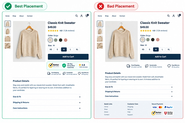
That’s exactly why the add-to-cart button trust badge placement matters so much. A badge placed too far from the button gets scrolled past and forgotten. A badge pile crammed right on top of it just slows the eye down before the click happens.
What tends to work:
- 2–3 badges max, directly under or beside the Add to Cart button
- Lead with security and guarantee badges; save social proof for near the reviews section
- Never stack more than one guarantee-style badge; it starts to look like overcompensation
What tends to backfire:
- Six-plus badges crammed together above the fold
- Generic badges with no real backing behind them
- Badges buried below the fold where nobody scrolls before adding to cart
Badges worth actually using here: a Norton Secured or McAfee SECURE seal (recognizable third-party logos carry more visual weight than a generic “100% Safe” graphic), a “Judge.me” or “Loox” style review count badge pulled from your real reviews, and a simple money-back guarantee icon.
The ones that grab attention are the ones a shopper already recognizes from somewhere else, familiarity does more work than a clever design.
Cart Drawer Trust Badges: Strengths, Weaknesses, Best Use Cases
The cart drawer is a different moment entirely. She’s already said “yes” once by clicking Add to Cart. Now she’s quietly deciding whether to keep going or close the drawer and think about it later.
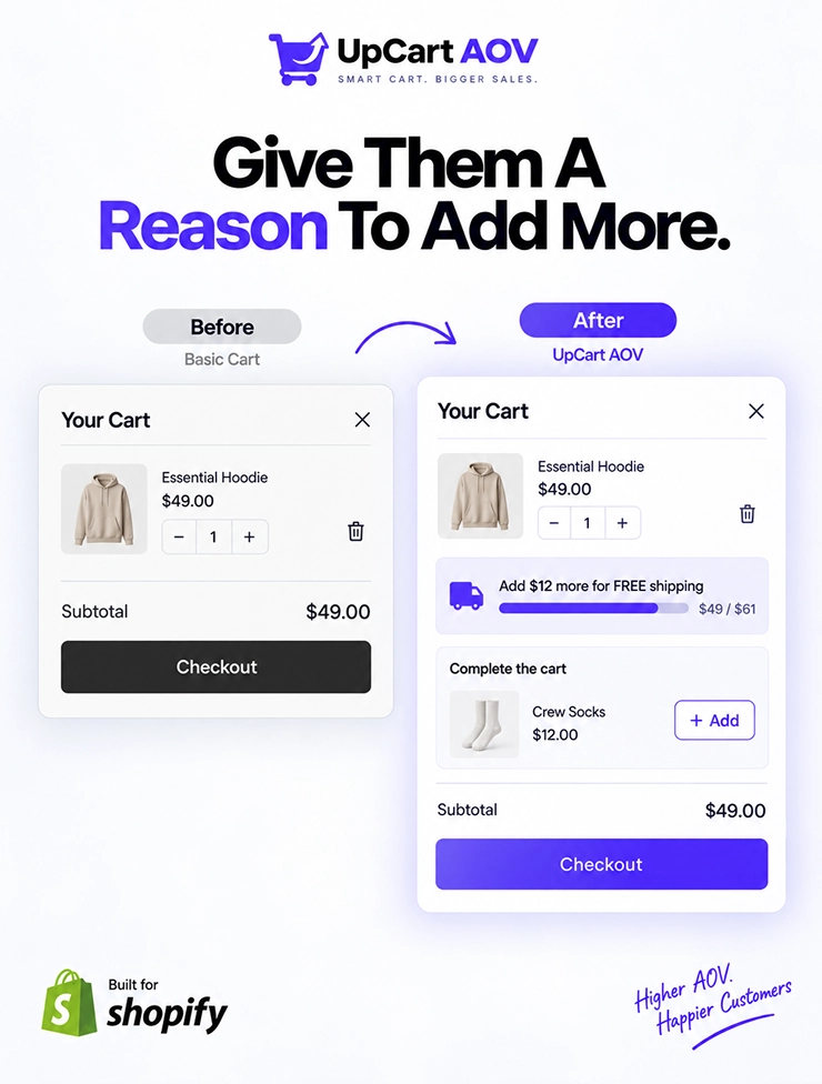
This is the second decision point, and it’s also where trust and average order value overlap. If your drawer shows upsells or bundle suggestions, the job UpCartAOV was built around, a well-placed badge right next to those suggestions softens the hesitation that comes with adding even more to the cart.
Cart drawer trust badges best practices worth borrowing:
- A shipping-threshold badge (“You’re $12 away from free shipping!”), doubles as urgency and trust
- One small guarantee or returns badge near the checkout button inside the drawer
- Keep it to one or two badges, max; the drawer is a small, fast-moving space
Badges worth actually using here: a live shipping-progress bar (these grab attention because they move and update in real time, not because of the icon itself), a compact “Free Returns” or “30-Day Guarantee” badge, and a small payment-icon row (Visa, Mastercard, Shop Pay) right above the checkout button so the next step feels familiar before she even clicks.
Checkout Page Trust Badges: Strengths, Weaknesses, Best Use Cases
By the time she reaches checkout, the doubt has narrowed to one thing: is my payment safe?
This is where checkout page trust badge placement tips matter most, because the wrong badge here does nothing, while the right one can quietly decide whether the sale completes.
Security badges near payment fields placement is the single highest-leverage move at this stage. She’s actively typing card details; a small SSL or payment-provider badge sitting right beside that field reassures her in the exact second she needs it.
Worth noting: Shopify checkout customization is more flexible on Shopify Plus than on standard plans, so some merchants will be working within theme or app-level limits rather than a fully custom checkout.
What tends to work:
- One security badge directly beside or above the payment field
- Payment provider logos near the “Pay Now” button
- Skip guarantee and social proof badges here entirely; they belong earlier in the funnel
Badges worth actually using here: an SSL/padlock indicator right beside the card field, recognizable payment logos (Visa, Mastercard, PayPal, Apple Pay) near the “Pay Now” button, and a Norton or McAfee seal if you’re a newer or lesser-known brand.
These grab attention simply because they’re logos a shopper has seen a hundred times before on other sites; recognition, not novelty, is what does the reassuring here.
Side-by-Side Comparison Table
Here’s the full comparison of trust badges product page vs cart vs checkout, laid out in one place.
| Placement | Primary Shopper Doubt | Best Badge Types | Funnel Stage | Risk of Overuse |
| Product Page | “Is this store/product legit?” | Security + Guarantee | Consideration | High, clutter near the Add to Cart button |
| Cart Drawer | “Should I keep going?” | Shipping threshold + Guarantee | Decision | Medium, drawer space is limited |
| Checkout | “Is my payment safe?” | Security + Payment logos | Payment | Low, but the wrong badge type wastes the space |
Expertise: How to Choose Placement Based on Your Store Type
Not every store needs the same strategy. Here’s how I’d adjust based on what tends to repeat across different kinds of stores:
Not every store needs the same strategy. Here’s how I’d adjust based on what tends to repeat across different kinds of stores:
| Store Profile | Recommended Focus | Why |
| New store, low trust | Heavier on product page security + guarantee badges | Strangers need more upfront reassurance |
| Established brand | Lighter product page, stronger cart drawer signals | Trust is partly already earned, reinforce, don’t oversell |
| High-ticket products | Guarantee badge visible at every stage | Bigger purchases need repeated reassurance |
| Low-ticket / impulse buys | Minimal badges, focus on checkout security only | Too much friction kills impulse momentum |
Mobile shoppers deserve a mention too; screen space is tight, so badges need to be smaller and fewer, placed where a thumb naturally stops scrolling.
None of this is a fixed rulebook. Your audience, price point, and niche get the final say, so give any placement two or three weeks of real traffic before locking it in.
Small, staged changes beat a full overhaul; you can actually tell which change moved the needle.
Authoritativeness: What the Data Says
This isn’t just a hunch; it lines up with the wider research on checkout behavior.
Roughly a quarter of shoppers abandon checkout specifically because they don’t trust a site enough to hand over their card details, and the overall cart abandonment rate has sat around 70% for over a decade despite constant improvements to payment technology.
That gap is exactly where placement, not just presence, starts to matter.
| Source | Key Finding | Link |
| Baymard Institute | 25% of shoppers abandon checkout over credit card security concerns, and the average cart abandonment rate sits at 70.22% across 50 aggregated studies | baymard.com/lists/cart-abandonment-rate |
| CXL Institute (original research) | Norton Secured was the most trusted trust mark among consumers, followed by Google Trusted Store and BBB Accredited Business | cxl.com/research-study/trust-seals |
None of this means “badges alone will fix your conversion rate.” But it does confirm the instinct behind this whole blog: recognizable, well-placed badges reduce a specific kind of doubt, and that doubt shows up at a very predictable, very measurable rate across the wider industry.
Trustworthiness: Common Mistakes That Undermine Trust Badges
A few mistakes come up again and again, and they quietly erode the very trust these badges are supposed to build.
- Fake or unverified badges: using a security logo you haven’t actually licensed is a legal risk, not just a design one
- Badge clutter: six badges in a row reads as overcompensation, not credibility
- Mismatched badges: a generic “As Seen On” badge with no real mention behind it does more harm than good once a shopper notices
If you’re ever unsure, ask: would a skeptical friend, glancing at this page for five seconds, feel more confident, or more suspicious?
Implementation Checklist
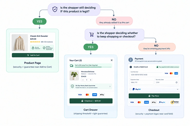
- Audit your current badges across all three zones: product page, cart drawer, checkout
- Remove duplicate or unverified badges
- Match each badge to the doubt relevant to that stage, using the flow chart above
- Test one placement change at a time instead of overhauling everything at once
- Track add-to-cart rate, cart-to-checkout rate, and checkout completion rate separately; they respond to different badges
Conclusion
That merchant didn’t need more badges. He needed the three he already had, sitting in the right spots. Where to put trust badges on your Shopify store comes down to one question at each stage: what is she doubting right now?
Get that right, and the badges stop being decoration; they start doing their job.
If your cart drawer already carries upsells and you want it carrying trust too, that’s the gap UpCartAOV was built to close.
FAQ
Question: Do trust badges actually increase conversions?
Answer: They can, but only when placed at the right stage. A badge in the wrong spot, like a guarantee badge sitting at checkout, adds visual noise without addressing the shopper’s actual doubt at that moment.
Question: How many trust badges is too many?
Answer: As a rough rule: 2–3 on the product page, 1–2 in the cart drawer, and 1 focused badge at checkout. Beyond that, badges usually start signaling insecurity instead of credibility.
Question: Should I show trust badges in the cart drawer if I already show them on the product page?
Answer: Yes, but with a different purpose. The product page badge answers “is this real,” while the cart drawer badge should answer “should I keep going”, usually through a shipping threshold or a light guarantee reminder rather than repeating the same security badge.
Question: Does trust badge placement differ for mobile vs desktop shoppers?
Answer: Yes. Mobile screens leave far less room, so badges need to be smaller and fewer, usually one badge near a sticky Add to Cart bar rather than a row of icons crowding a small screen.
Question: Can I use the same trust badge design across product page, cart drawer, and checkout?
Answer: The visual style can stay consistent for brand recognition, but the badge type itself should/ change with the moment, matching the message to the doubt matters more than matching the design.

