
Every online store has a small strip at the top of the page that most people barely notice, yet it quietly shapes how visitors feel about the brand within the first few seconds. This is the announcement bar, and in my experience, it’s one of the most underused tools on a website.
I’m Anurag Pandey, leading ControlF5, a Shopify agency where we’ve worked on hundreds of stores over the years, and one thing I keep noticing is that brands invest heavily in product pages and ads, but overlook this one strip of space that every single visitor sees before anything else.
A good announcement bar can lift conversions, reduce cart abandonment, and even build trust before a visitor scrolls a single inch. A bad one just adds clutter.
In this post, I’ll break down what an announcement bar is, how to write copy that actually converts, ready to use templates, real world examples, common mistakes, and how to test your bar so it keeps improving over time.
What Is An Announcement Bar?
An announcement bar for ecommerce is a thin strip, usually placed at the very top of a website, that displays a short message to every visitor. It sits above the main navigation and stays visible no matter what page someone is browsing.
Think of it as your store’s megaphone. It is the first thing a visitor reads, even before your logo grabs their attention.
A website announcement bar is commonly used to highlight:
- Shipping offers
- Ongoing sales or discounts
- New product launches
- Limited time deals
- Email or SMS signup incentives
- Trust signals like return policies or reviews
Most Shopify themes let you add this bar natively through the theme editor, and many stores also use dedicated apps for extra customization like countdown timers, multiple rotating messages, or mobile specific text.
Setting up an announcement bar in website form takes just a few minutes once you’re in the theme editor, no coding needed.
The reason I think announcement bar design matters so much is simple. It does not require a click to be seen. Every single visitor sees it, which makes it one of the highest visibility spots on your entire site.
Announcement Bar Copywriting Formulas
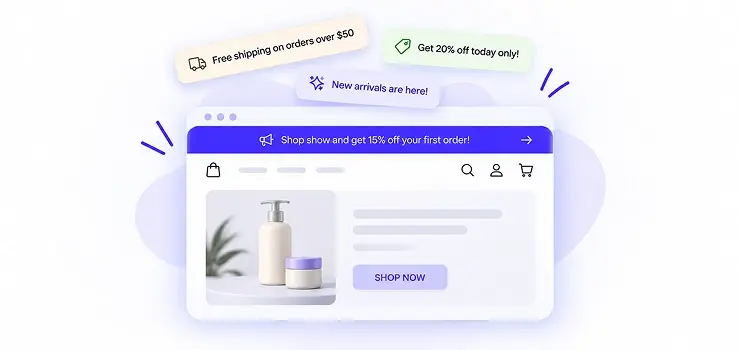
Writing announcement bar copy is not about being clever. It is about being clear, quick to read, and giving the visitor a reason to care in under two seconds. Here’s the one master formula I lean on behind almost every strong announcement bar, followed by five ways to apply it.
Hook + Trigger = Announcement Bar Copy
The Hook is what grabs attention, usually a benefit, offer, teaser, trust signal, or scarcity point. The Trigger is what pushes the visitor to act right now, like a deadline, a number, or a call to action. Put the two together and you get a complete, ready to use bar.
Here is that one formula applied five different ways:
1. Benefit Plus Urgency
Free Shipping + Today Only = Free shipping today only, no code needed
2. Offer Plus Deadline
20% Off + Ends Sunday = 20% off everything, ends Sunday night
3. Curiosity Driven
Something New + Tap To See = Something new just landed, tap to see what it is
4. Social Proof
Happy Customers + 40,000 = Loved by over 40,000 happy customers
5. Loss Aversion
Few Left + Grab It Now = Only a few left in your size, grab it before it’s gone
Announcement Bar Examples
Here’s a set of original, ready-to-use announcement bar messages I’ve grouped by purpose. Feel free to tweak the numbers, product names, or tone to match your brand voice.
Free Shipping Bar Copy
| Message | Best Used For |
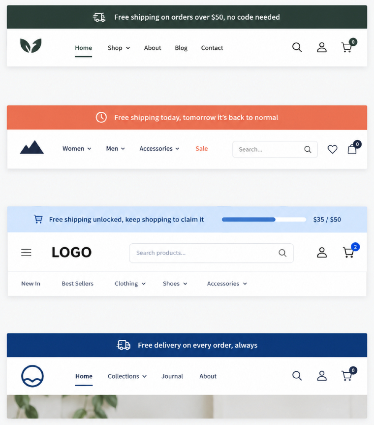
| Free shipping on orders over $50, no code needed | General storewide offer |
| Free shipping today, tomorrow it’s back to normal | Creating urgency |
| Ship it free when you spend $75 or more | Encouraging bigger cart size |
| Free delivery on every order, always | Brand promise or USP |
| Free shipping unlocked, keep shopping to claim it | Progress bar style bars |
Sales Announcement Bar Ideas
| Message | Best Used For |
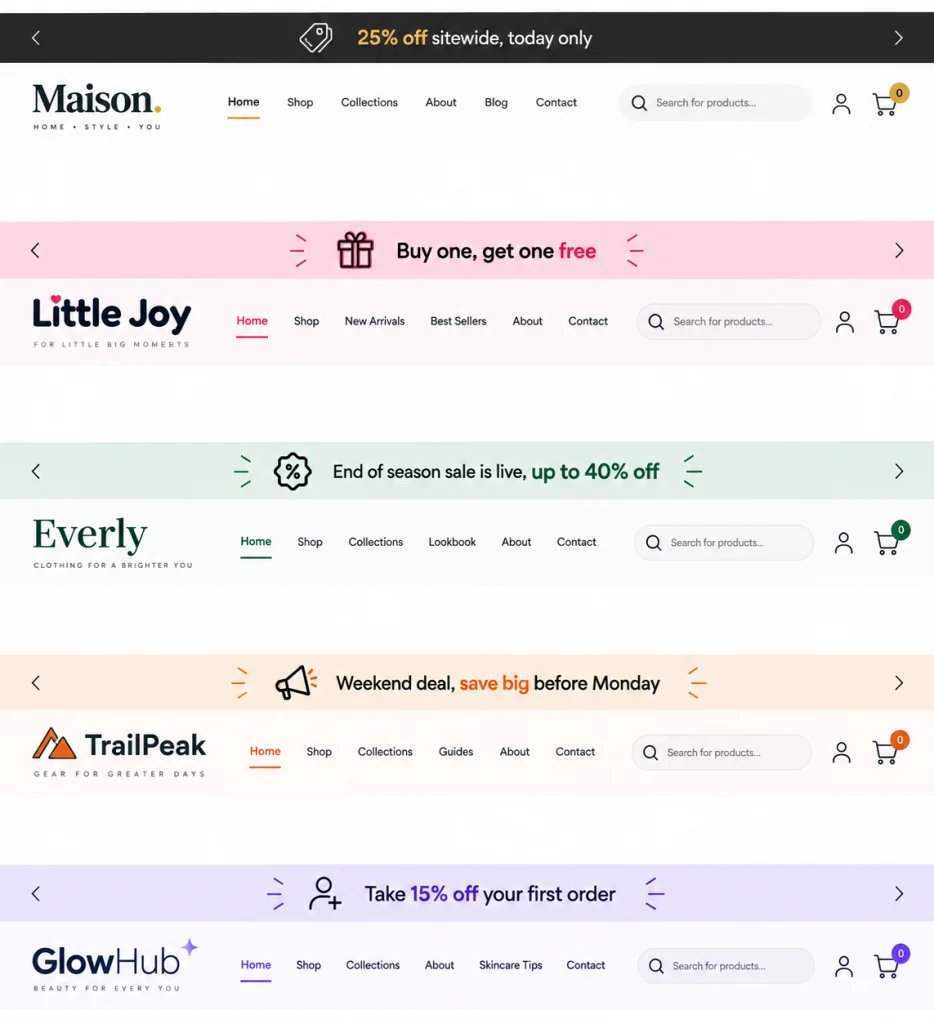
| 25% off sitewide, today only | Flash sale |
| Buy one, get one free | BOGO style promotion |
| End of season sale is live, up to 40% off | Seasonal clearance |
| Weekend deal, save big before Monday | Weekend focused campaigns |
| Take 15% off your first order | New customer offer |
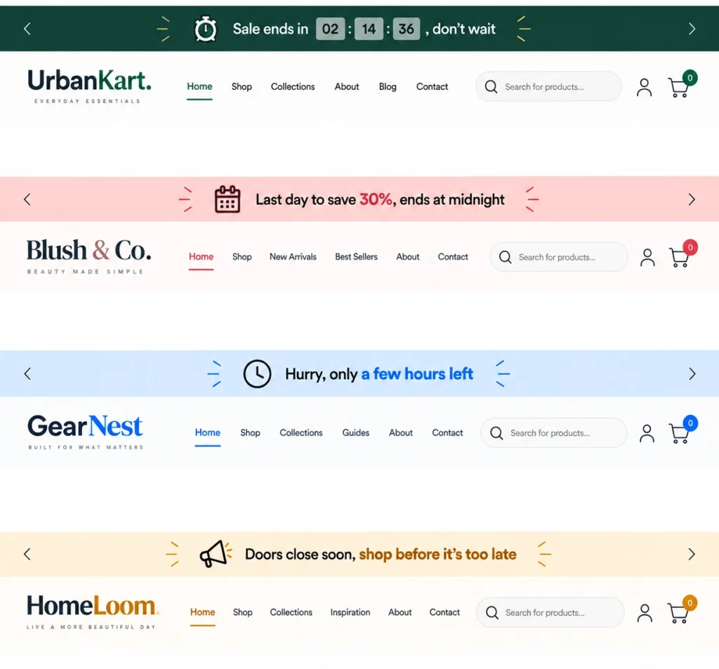
Countdown And Urgency Bars
Pairing your message with a real deadline gives visitors a reason to act instead of putting it off.
| Message | Best Used For |
| Sale ends in [timer], don’t wait | Countdown timer apps |
| Last day to save 30%, ends at midnight | Final day reminders |
| Hurry, only a few hours left | Late stage urgency |
| Doors close soon, shop before it’s too late | Pre launch or pre closing sales |
New Launch Bars
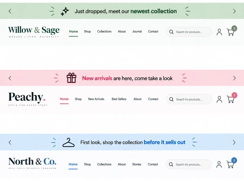
| Message | Best Used For |
| Just dropped, meet our newest collection | Product launch |
| New arrivals are here, come take a look | General new stock update |
| First look, shop the collection before it sells out | Exclusive early access |
Restock Alerts
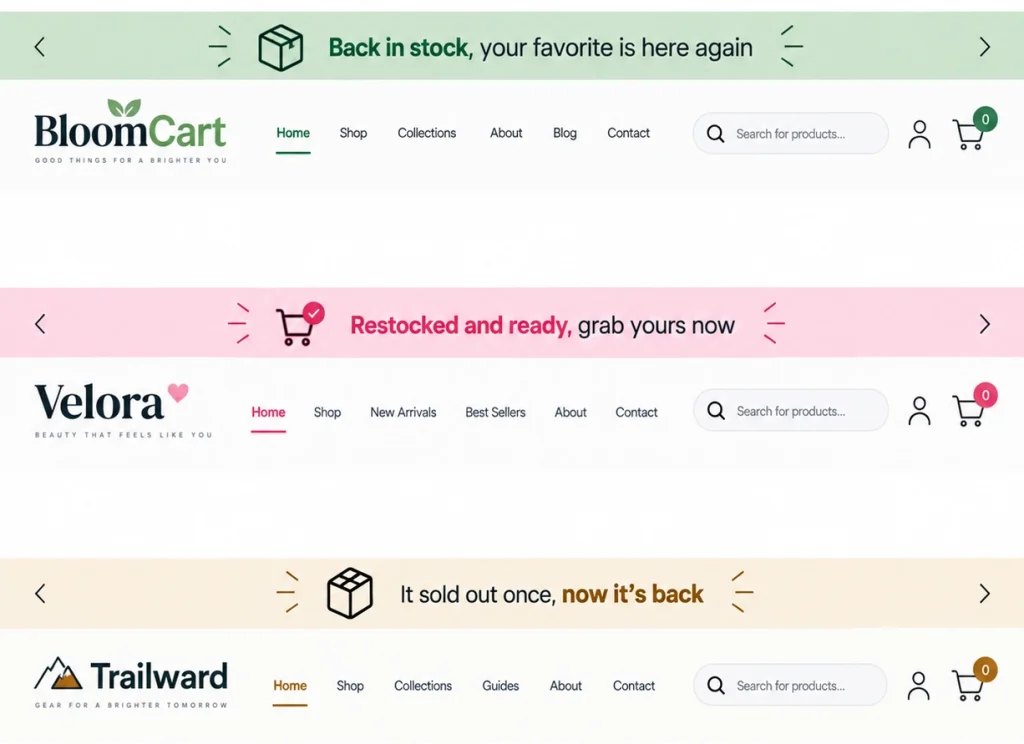
| Message | Best Used For |
| Back in stock, your favorite is here again | Popular item restock |
| Restocked and ready, grab yours now | General restock |
| It sold out once, now it’s back | Building excitement around demand |
Email Or SMS Signup Bars
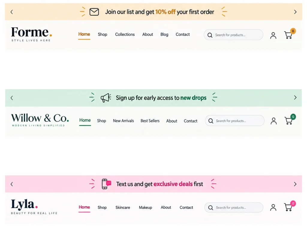
| Message | Best Used For |
| Join our list and get 10% off your first order | Email capture |
| Sign up for early access to new drops | Loyalty building |
| Text us and get exclusive deals first | SMS marketing signup |
Loyalty And Rewards Bars
| Message | Best Used For |
| Earn double points on every order this week | Loyalty program push |
| Members save more, join free today | Membership growth |
| Your rewards are waiting, check your points | Re engagement |
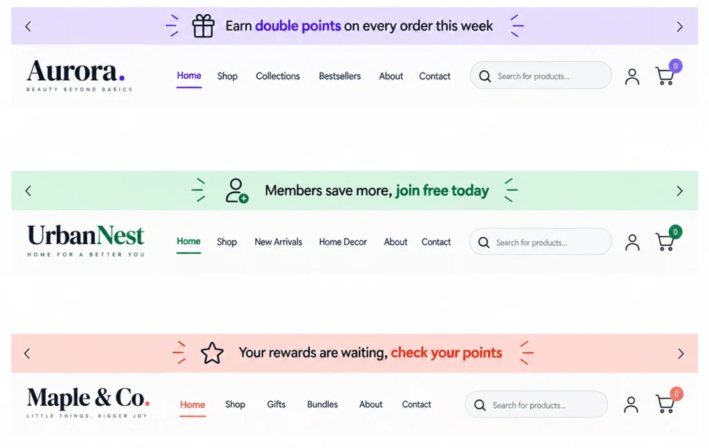
Trust And Brand Bars
| Message | Best Used For |
| Easy 30 day returns, shop worry free | Trust building |
| Handmade with care, shipped worldwide | Brand story |
| Rated 4.9 out of 5 by our customers | Social proof |
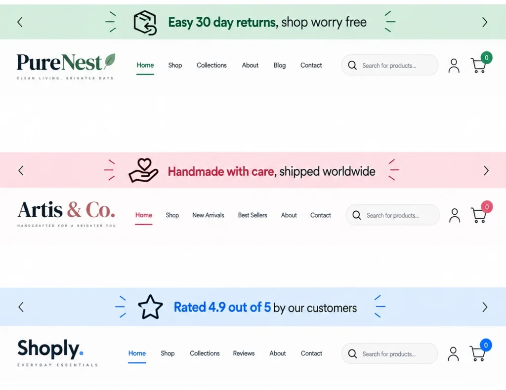
Announcement Bar Copy Examples From Real Brands
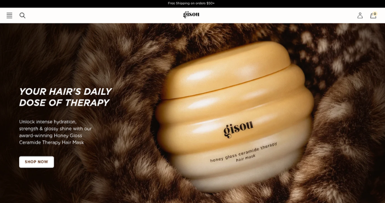
1. Gisou
A free shipping bar styled to blend with their site colors, tied to a limited-time threshold to create urgency
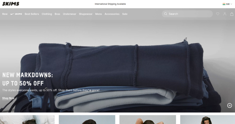
2. SKIMS
Uses a plain international shipping bar styled with no color or decoration, letting the policy statement build trust on its own without pushing urgency.
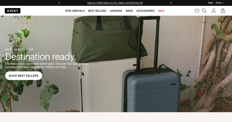
3. Away
Uses a bold black bar with rotating arrows to highlight a bundle discount, framing the savings around building a set rather than pushing a single item.
Something I always point out to clients: Away’s bar doesn’t just say one thing and stop, it rotates through four different messages on a loop, so the same strip of space works four times harder than a static bar would.
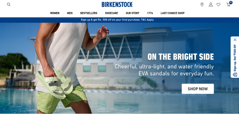
4. Birkenstock
Uses a solid navy bar tied directly to a first-purchase discount, and backs it up with a matching sticky side tab, so the same signup offer stays visible whether someone scrolls past the top bar or not.
Do’s And Don’ts Of Announcement Bar Copy
A few small habits I’ve noticed can be the difference between a bar that gets noticed and one that gets ignored, here are the dos and don’ts I keep handy:
| Do | Don’t |
| Keep the message under 10 words when possible | Stack multiple offers into one bar, it confuses readers |
| Use one clear call to action | Use vague urgency like “sale ends soon” without a real deadline |
| Match the tone of your brand voice | Forget to check how the text wraps on smaller screens |
| Rotate messages based on season or campaign | Leave the same message up for months without testing anything new |
| Make sure it looks good on mobile too | Use all caps for the entire message, it can feel like shouting |
How To A/B Test Your Announcement Bar Copy?
Writing good copy is only half the job. Testing it tells you what your actual audience responds to, instead of relying on guesswork or copying what worked for someone else’s store.
Even a small wording change, like swapping “Shop Now” for “Claim Offer,” can shift how many people actually click.
A/B testing simply means showing two versions of your bar to different visitors and comparing the results, so you can keep the version that performs better.
Metrics Worth Tracking
- Click through rate on the bar
- Overall site conversion rate
- Average order value during the campaign
- Bounce rate right after the bar loads
What To Test?
- Short copy versus slightly longer copy
- Urgency based messages versus benefit based messages
- Different call to action wording, like “Shop Now” versus “Claim Offer”
- Bar color and placement on the page
A Simple Testing Approach
- Pick one variable to test at a time, like the headline text
- Run each version for a similar time period or traffic volume
- Compare click through rate and conversion rate side by side
- Keep the winner live and test the next variable
Most of the Shopify stores I’ve worked with use dedicated apps to manage this kind of testing, since manually editing theme code for every version can get messy. Tools that let you rotate multiple announcement bar messages automatically make this process much easier, letting you target specific pages or audiences with different messages without touching any code.
Conclusion
An announcement bar might be small, but it carries a lot of weight. It is one of the few spots on your website that every single visitor sees, whether they scroll or not. Getting the copy right can turn casual browsers into buyers, while the wrong message can get ignored completely.
My advice: start with one or two templates from this post, keep the message short, give people a clear reason to act, and test regularly to see what actually works for your audience. Small changes in your announcement bar copy can lead to noticeable improvements in clicks and conversions over time.
And if you’re looking to push average order value beyond just the announcement bar, tools like UpCartAOV bring free shipping bars, bundles, and upsells together right inside your cart drawer.
Frequently Asked Questions (FAQs)
Question: How long should announcement bar copy be?
Answer: Aim for under 10 words. Visitors scan the bar in a second or two, so shorter messages perform better than long sentences. If your message needs more than that, it is usually a sign you are trying to say too much in one bar.
Question: Should I use one bar or rotate multiple messages?
Answer: Rotating two or three messages works well if you have more than one offer running, like free shipping and a sale. Just make sure each message still stays short and clear.
Question: Does an announcement bar actually improve conversion rate?
Answer: Yes, when the copy is clear and relevant, an announcement bar can improve click through rate and even average order value, especially when paired with a free shipping threshold or urgency based offer.
Question: Can an announcement bar hurt my site instead of helping it?
Answer: Yes, if it is too long, hard to read, or repeats the same message for months without change. A cluttered or outdated bar starts to blend into the background and visitors stop noticing it.
Question: Should every page on my site show the same announcement bar?
Answer: Not always. A homepage might show a general offer, while a product page could show a more specific message, like a shipping threshold or a restock note relevant to that item.

