
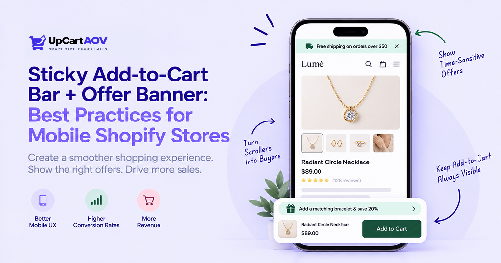
I have rebuilt the mobile product page for more clients than I can count at this point, and recurring combination that always stands out. This works, not because it is some big surprise, but because most people these days interact with their phones in a certain way that is unforgiving to those who do not adapt
I am Anurag Pandey, and I say this after running ControlF5, a Shopify agency, for more than 13 years now. Most Shopify stores still treat mobile as a smaller version of desktop.
Someone browsing on their phone is scrolling fast, comparing tabs, probably distracted by a notification, and the checkout button is nowhere near their thumb by the time they decide to buy.
A sticky add to cart bar shopify setup fixes that last part. An offer banner Shopify merchants use well fixes the hesitation part. Together they solve two different problems at once.
In this post I am walking through what each of these actually is, why mobile specifically needs both, and then getting into the real meat of it, the best practices that separate a sticky bar that converts from one that just sits there annoying people.
What Is a Sticky Add to Cart Bar?
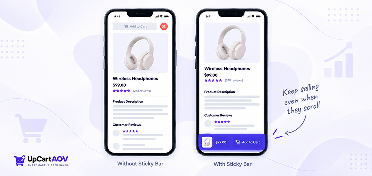
A sticky add to cart bar is a thin strip, usually fixed to the bottom of the screen, that stays visible while a shopper scrolls through a product page.
It typically shows the product name or image, the price, sometimes a variant selector, and an Add to Cart button that never disappears no matter how far down the page someone scrolls.
How It Works and Where It Sits on the Page?
On most Shopify themes the main Add to Cart button lives near the top of the product page, right under the price and above the description.
The problem is that a lot of shoppers scroll past that button to read reviews, check sizing charts, or look at more images. Once they scroll down, that button is gone.
A sticky add to cart bar Shopify app usually injects a fixed position element at the bottom of the viewport that appears once the original button scrolls out of view. I have tested this on a handful of client Shopify stores, and the pattern is consistent.
Shoppers who scroll past the original CTA are far less likely to scroll all the way back up just to buy. Give them a persistent button instead and you remove that friction entirely.
Market Insight: What a Real A/B Test Revealed About Sticky Bars
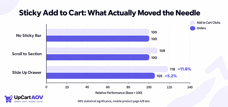
| Variation | Description | Orders Lift | Add to Cart Clicks Lift | Statistical Significance |
| A | No sticky add to cart button | Baseline | Baseline | — |
| B | Sticky bar that scrolls the user to the add to cart section | No meaningful lift | +6% | Not significant |
| C | Sticky bar that slides up a cart drawer with add to cart options | +5.2% | +11.8% | 98%+ significant |
Source: Growth Rock, 2026
What Is an Offer Banner?
An offer banner is a visible strip of messaging, usually at the top of the page or embedded near the cart, that communicates a deal, a threshold, or an incentive.
Think free shipping over a certain amount, a percentage off code, a countdown for a flash sale, or a bundle deal.
The types I see work best on Shopify stores fall into four buckets:
| Banner Type | What It Does | Best Used For |
| Discount code banner | Shows a flat percentage or dollar amount off | New visitor promotions, seasonal sales |
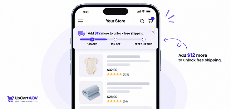
| Free shipping threshold | Shows progress toward a free shipping unlock | Increasing average order value |
| Urgency or countdown | Shows a timer for a limited-time offer | Flash sales, restock announcements |
| Bundle offer | Highlights a discount for buying multiple items | Shopify stores with complementary products |
One thing I noticed is that a free shipping threshold banner tends to outperform a flat discount code for Shopify stores with an average order value close to a natural shipping cutoff.
If your AOV is around 65 dollars, setting free shipping at 75 dollars gives people a real reason to add one more item instead of just taking a blanket discount.
Why Mobile Needs Both, Together
Desktop shoppers have more screen real estate to work with. They can see the Add to Cart button, the price, and often a banner all in one glance without scrolling. Mobile shoppers do not get that luxury.
Mobile UX Constraints
A phone screen forces tradeoffs that desktop never does.
- Thumb zone. Most people hold a phone one handed and can comfortably reach the bottom third of the screen with their thumb. Anything above that requires a stretch or a second hand.
- Limited vertical space. A product page that looks clean on desktop can feel like an endless scroll on mobile once you account for images, descriptions, and reviews.
- Scroll behavior. Mobile users scroll faster and more impatiently than desktop users. A CTA that is not visible within a second or two of intent is often missed entirely.
How the Combo Reduces Friction and Drop Off
When I put a sticky add to cart bar and an offer banner on the same mobile page, I am solving two separate decision points. The sticky bar answers “how do I buy this right now” no matter where the shopper is on the page.
The offer banner answers “why should I buy this right now” by giving them a reason tied to value.
On one client site running a mobile ecommerce sticky add to cart bar setup alongside a free shipping banner, we saw mobile add to cart rate move from roughly 3.1 percent to somewhere around 5 percent within the first month after launch.
I am not going to claim that number generalizes to every Shopify store, results depend heavily on traffic quality and price point, but the direction of the shift is something I have seen repeat across multiple Shopify stores.
Best Practices for Sticky Add to Cart Bars
Placement
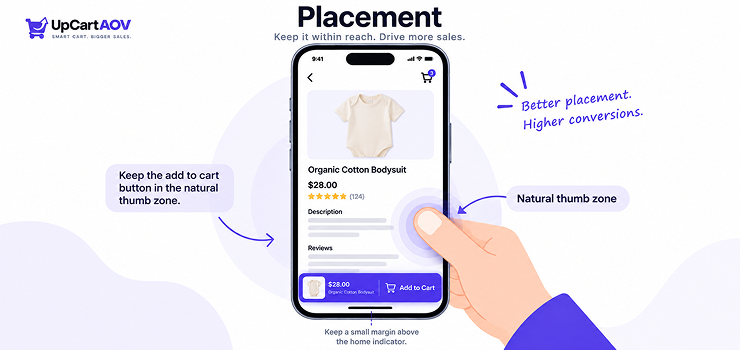
Put the bar at the bottom of the screen, not the top. Most people hold their phone with one hand and use their thumb to tap things, and the bottom of the screen is where the thumb naturally reaches. The top is a stretch.
One thing developers often miss is the space at the very bottom of the screen, where the phone’s own buttons live, like the home bar on iPhone or the gesture bar on Android.
If the sticky bar sits too low, it overlaps with that and looks broken. Leave a small gap above it so the bar stays clearly visible on its own.
What to Include
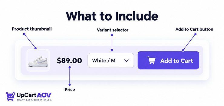
Keep the bar simple. It only needs a few things.
- A small product image, just enough for the shopper to recognize what they’re adding
- The price, and if there are variants, the price should update when the variant changes
- A variant selector, but only if the product has options like size or color
- A quantity selector, only if people commonly buy more than one at a time
- A clear Add to Cart button that stands out
Skip the product title. The shopper already knows what they’re looking at since they scrolled past the title to get here, so there’s no need to repeat it in a small space.
When It Should Appear
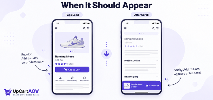
There are two common approaches. Always visible from page load, or scroll triggered once the original Add to Cart button leaves the viewport.
I lean toward scroll triggered for most Shopify stores. Showing the sticky bar immediately on page load feels redundant when the primary CTA is already visible above the fold.
It also uses up valuable screen space the moment someone lands on the page, before they have even decided if they are interested.
The exception is long product pages with heavy content above the fold, think Shopify stores with big hero banners or trust badge sections before the actual buy box.
In that case, showing the sticky bar from the start makes sense because the primary CTA might not be visible for several scrolls.
Avoiding Clutter or Overlap With Other UI Elements
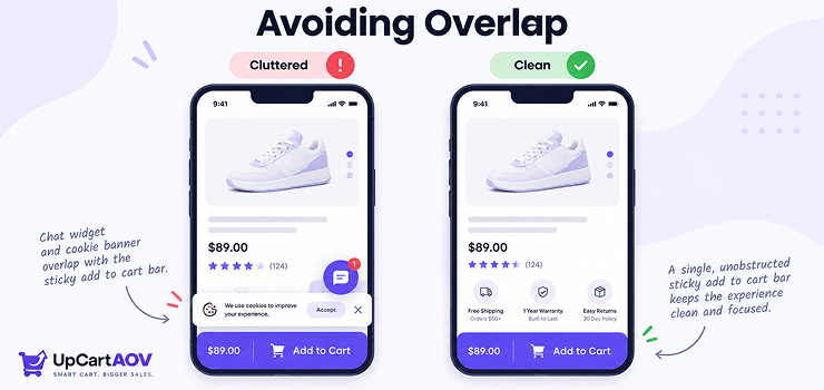
This is where a lot of Shopify sticky cart bar best practices guides fall short, because they do not talk about what happens when your sticky bar collides with other fixed elements.
Common conflicts I have run into include chat widgets, cookie consent banners, and Shopify app install prompts, all of which love to anchor themselves to the bottom of the screen.
Before launching a sticky add to cart bar, audit every other Shopify app installed on the theme and check what else is fighting for that same bottom strip of screen real estate.
Stacking two fixed bottom elements on a 375 pixel wide screen is a fast way to make your product page look broken.
Best Practices for Offer Banners
Positioning
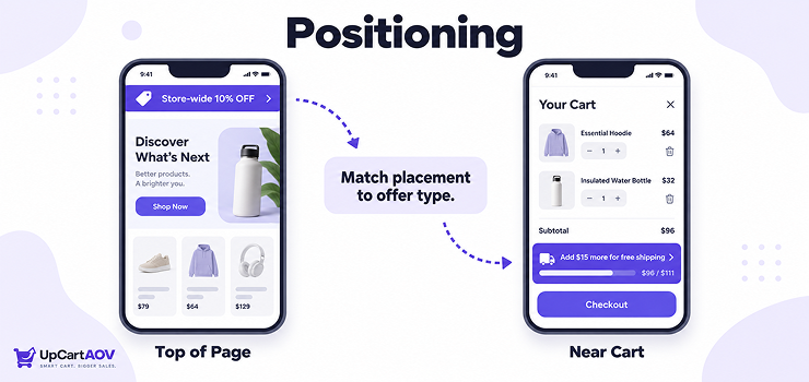
Top of page works well for Shopify store wide promotions that apply regardless of what someone is browsing. Sticky positioning near the cart or buy box works better for offers tied to a specific action, like a free shipping threshold that updates as someone adds items.
I would actually push back on the common advice to make every banner sticky. A sticky discount code banner sitting at the top of the screen permanently eats into vertical space that mobile users desperately need for actual product content.
Unless the offer is tied to a countdown that benefits from constant visibility, a static banner near the top of the page is usually enough.
Messaging Clarity and Urgency Without Being Pushy
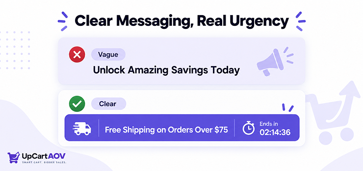
Keep the copy short. “Free shipping on orders over 75 dollars” beats “Unlock amazing free shipping benefits today only.” Mobile screens do not have room for marketing fluff, and shoppers scan rather than read on small screens.
Urgency works, but only when it is real. A countdown timer that resets every time someone reloads the page destroys trust the moment a shopper notices, and mobile shoppers notice fast because they often reload pages while comparing tabs.
Dismissibility and Re-engagement
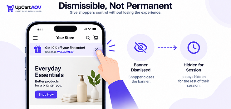
Always give mobile users a way to close the banner. A permanently fixed banner that cannot be dismissed feels aggressive, especially on a small screen where it is already competing for space. That said, once dismissed, do not bring it back on every single page navigation within the same session. Respect the dismiss action for the length of that browsing session at minimum.
Personalization
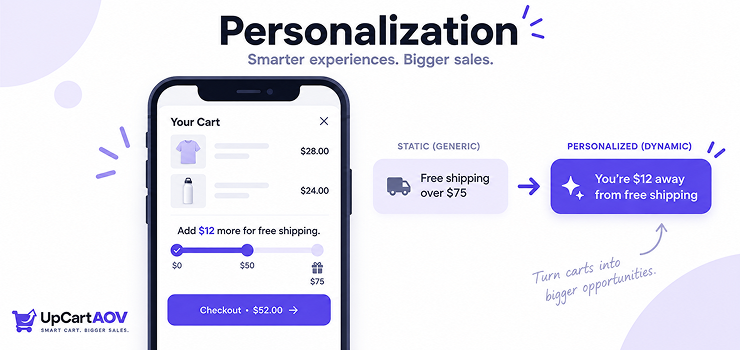
A free shipping progress bar, the kind you see on Shopify stores like Gymshark or Fashion Nova, tends to outperform a static free shipping banner because it turns the offer into a small goal rather than a flat statement. Something like “Add 12 dollars more for free shipping” gives shoppers a concrete reason to keep browsing instead of checking out immediately.
Cart value based offers work similarly. Once someone crosses a certain cart threshold, swapping the banner message to reflect a new tier, like a bundle discount or a free gift, keeps the incentive relevant instead of static throughout the whole session.
Combining Both Without Hurting UX
Avoiding Stacking or Overlap Issues on Small Screens
The biggest mistake I see is a sticky offer banner at the top and a sticky add to cart bar at the bottom, both permanently visible, squeezing the actual product content into a narrow middle strip on smaller phones. On a device with a 5.5 inch screen this can eat up nearly a quarter of visible space before someone even sees the product.
My general rule is one sticky element at a time. If the offer banner is sticky, let the add to cart bar be scroll triggered, and vice versa. Test both combinations on an actual small device, not just a browser resize, because emulators tend to undersell how cramped things feel on a real phone in someone’s hand.
Load Speed and Performance Considerations
Every sticky add to cart bar Shopify app adds JavaScript that runs on scroll events. Poorly built ones can cause janky scrolling or layout shift, which directly hurts mobile page speed scores. Before installing any Shopify app for this, check whether it uses passive scroll listeners and whether it loads asynchronously. A one or two second delay in when the sticky bar appears is far less costly than a Shopify store wide drop in Core Web Vitals from a badly coded app.
A/B Testing Placement and Messaging
Do not assume the first version you launch is the right one. I have flipped sticky bar trigger points, banner copy, and even button color on client Shopify stores and seen meaningful shifts in add to cart rate from changes that looked minor on paper. If your Shopify store gets enough mobile traffic to reach statistical significance within a couple weeks, run the test. If traffic is lower, at least alternate configurations monthly and track the trend rather than relying on gut feeling alone.
Common Mistakes to Avoid
Even a well-built sticky bar and offer banner combo can backfire if a few small details get overlooked. Here are the ones I see most often.
- Double sticky elements: Making both the banner and the sticky bar permanently fixed leaves almost no room for actual content on the screen.
- Vague banner copy: Using generic phrases instead of specific numbers or thresholds makes the offer feel less real and easy to ignore.
- Ignoring other fixed Shopify apps: Forgetting to test how the sticky bar interacts with things like chat widgets often leads to overlapping elements.
- Fake urgency: Showing a countdown timer that resets on every page reload breaks trust the moment a shopper notices.
- Skipping safe area insets: Not accounting for iOS and Android system bars causes the sticky bar to get clipped or partially hidden.
- Overcrowding the bar: Cramming in too many elements makes buttons too small to tap accurately on a smaller screen.
How UpCartAOV Brings This to Life on Shopify?
We built UpCartAOV around cart drawer upsells, and one of its strongest features is a live free shipping and discount progress bar that updates instantly as a customer adds items, showing them exactly how close they are to unlocking free shipping or a percentage off. It is the same cart value based personalization discussed earlier, just built directly into the cart drawer where shoppers already have their full attention.
Founder’s Take
“The sticky bar gets someone to the cart. The offer banner gives them a reason to add one more thing before they get there. Most Shopify stores nail one and forget the other, and that gap is usually where the extra revenue was sitting the whole time.”
— Anurag Pandey, Founder, ControlF5 and UpCartAOV
Conclusion
A sticky add to cart bar solves the “how do I buy this” problem on mobile. An offer banner solves the “why should I buy this now” problem. Put them together without stacking two permanent fixed elements on a small screen, and mobile conversions typically move in the right direction.
Keep the sticky bar at the bottom, scroll triggered in most cases. Keep the banner copy specific and dismissible. Avoid stacking two sticky elements at once. And test real configurations on a real phone before assuming desktop results will translate.
If you have not tested this combination yet, it is one of the simpler changes that tends to show a real, measurable lift. And if you want a cart upsell tool built around this kind of behavior driven personalization, UpCartAOV is worth a look.
Visit UpCartAOV to see it live.
Frequently Asked Questions (FAQs)
Question: Does a sticky add to cart bar increase conversions?
Answer: In most cases, yes, especially on mobile. Keeping the buy button visible at all times reduces the chance a shopper abandons the page simply because they could not find their way back to the CTA.
Question: How do I add a sticky add to cart bar to my Shopify store?
Answer: Most Shopify themes do not include this by default, so it usually requires a dedicated Shopify app or custom code added to the theme. Some newer Shopify themes have started including a basic version, but customization options are often limited without an app.
Question: What should I avoid when using a sticky add to cart bar?
Answer: Avoid cramming too many elements into it, avoid letting it overlap with other fixed UI like chat widgets, and avoid making it permanently visible alongside a sticky offer banner, since two fixed elements at once can crowd out the actual product content on a small screen.
Question: Can offer banners hurt the shopping experience?
Answer: Yes. Stacking multiple banners, using fake countdowns, or making the banner permanently fixed on a small screen can crowd out product content and reduce trust, especially if the urgency does not feel genuine.
Question: Is a sticky add to cart bar necessary for desktop too?
Answer: Not usually. Desktop screens have enough space to keep the original Add to Cart button visible without much scrolling, so the biggest impact of a sticky bar is on mobile, where screen space is limited and scrolling is faster.

